Part 5. Finishing touches
19 Dress the one-click page
Your words, your image, your brand strip and progress steps on the page right after payment, and the few things Shopify keeps out of your hands.
Out of the box, the one-click page shows your product, its price, the discount and two buttons. That is enough to sell. This chapter is for when you want the page to sound and look like your store.
The settings sit in two places. What belongs to one offer is in the funnel editor, under Edit offer. What belongs to the whole page, on every offer, is on the Buyer page.
What Shopify keeps out of your hands
Shopify reviews this page closely, and a few rules are fixed:
- The two buttons, “Add to my order” and “No thanks”, cannot be renamed. They are translated into each buyer’s language for you.
- The product keeps its name and price. A selling headline is added above the product name; it never replaces it.
- A banner stays at the top of the page. You can let a countdown standing on its own take the place of the “order confirmed” banner, but there is always one.
- No exclamation marks, and nothing about delivery or tracking: no tracking number, no carrier, no delivery date.
The app refuses to save what would break these, instead of letting a reviewer or a buyer find it.
Your words, per offer
Under Your words on this page:
- Promise line, at the top of the page, next to the countdown if you use one.
- Selling headline, above the product name.
- Your argument, up to six lines, so the buy button stays above the fold on a phone.
- Badges, up to three short labels in green, amber or red. A badge can also be an image from your store files, which is the only way to get a rounded pill on this page.
A little markup works in these fields: **bold**, ~~struck out~~, a line starting with a dash
for a bullet, --- for a separator, and {success:…}, {warning:…} or {critical:…} to colour
a passage green, amber or red. No links, no italics.
You can also write {product}, {price}, {amount} (the price after your discount) or {save}
(what the buyer saves), and the real figure takes their place. When a figure is unknown for a
given buyer, the whole line is left out rather than shown with a hole in it. An unknown word in
braces is refused when you save.
One text for every language. These words are shown as you wrote them, to every buyer. The app does not translate them, because guessing at your sales copy is a good way to publish something embarrassing in a language you cannot check. If you sell in several languages, keep the copy short, or write it in the language most of your buyers read.
Your image, per offer
Under Your visual, choose an image from your store files or upload one. It replaces the product photo on this page. JPG, PNG, WebP or GIF, 3 MB at most: on the page right after payment, a heavy image is a page the buyer never sees. There is no field for a link to an image hosted elsewhere.
Page layout, per offer
Under Page layout you choose a large image beside the text or a small thumbnail with the price on the right, how the promise line looks, and whether the countdown sits inside a banner or on its own between two lines. Show the price summary adds the subtotal, shipping and new total under the offer. It is off by default.
The brand strip, for the whole page
On the Buyer page, The top banner takes a wide, short image across the top of the page, the same on every step. A phone column is about three times narrower, so a long strip shrinks there until nobody can read it. Add a second, taller version under The banner on phones; left empty, the wide one is used everywhere, just smaller.
Keep the product name and the discount out of the image itself. Shopify requires them as text on the page, so they are shown next to your banner anyway.
Progress steps, for the whole page
Also on the Buyer page, Progress steps shows up to three short labels in a row above the offer, the current one highlighted. Fill at least two, or leave them all empty for none. Describe the offer, not the delivery: a label that reads like shipping or tracking is flagged, because Shopify may reject it.
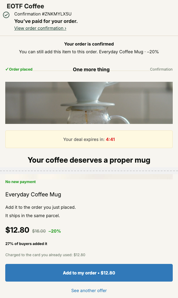
Check it in the preview
The Preview next to the offer editor runs the real page with your words and images, on mobile and desktop. It is the quickest way to catch a headline that pushes the button below the fold. Then place one real test order, as in chapter 4.
Last updated